National Library turns the page with a new visual identity

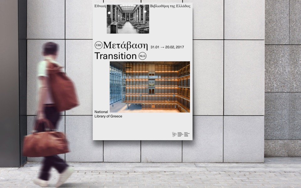
The National Library of Greece will be moving into its new home with a whole new visual identity. The open competition for the institution’s rebranding attracted proposals from 34 firms, all of which underscored the high quality of work being done by Greece’s graphic design community.
Of the five proposals that were short-listed, the project was eventually awarded to a team headed by designer and illustrator Dimitris Papazoglou (Giorgos Matthiopoulos, Giorgos Triantafyllakos and Axel Peemoeller), which will be unveiling the final strategic plan for the National Library’s public look, advertising profile and communications in four months’ time.
Though the team is not at liberty to divulge the details of its proposal, it stresses that the National Library’s new visual identity will not be restricted to an “isolated logo” and its simple application.
“The proposed system of visual communication elevates the role of content into the protagonist of a direct, extroverted and rich visual experience,” the team says. “It introduces a visual vocabulary that respects the tradition of print, while also incorporating it boldly into a contemporary framework.”
Short-listed team Associates, meanwhile, had approached the new logo as a motif that was seen being adapted to the library’s stationary, advertising signs and even T-shirts. Inspired by motifs from the art of bookbinding and the architecture of the library’s old home at the Vallianos building, a part of Athens’s Neoclassical Trilogy, and its new home at the Stavros Niarchos Foundation Cultural Center, but also the notions of the Golden Ratio, the Fibonacci Sequence and digital barcodes, Associates created a logo in which the building itself had an assumed presence and also used fonts with elements of the Greek alphabet.
Two interesting proposals were put forward by the K2 design team based on the Greek Beta, the first letter in the words for book and library, the blue color of the Greek flag. The first proposal was an artistic composition of these motifs, while the second incorporated the letter Beta into the form of an owl, the age-old symbol of wisdom and virtue.
The notions of knowledge and wisdom inspired the proposal by MNP, which used the form of the infinity symbol to spell National Library of Greece in a geometric font. The team’s second proposal cast the library as a “beacon of light” in a simple square frame that was accompanied by a depiction of the first Greek font.
Holy drew its design from the idea of an open book to signify the intellectual content of the library and its openness, or extroverted character, together with a modern interpretation of the ancient Greek meander, a shape that offers itself to multiple applications and interpretations.


